brand identity
OOR — science and nature in synthesis
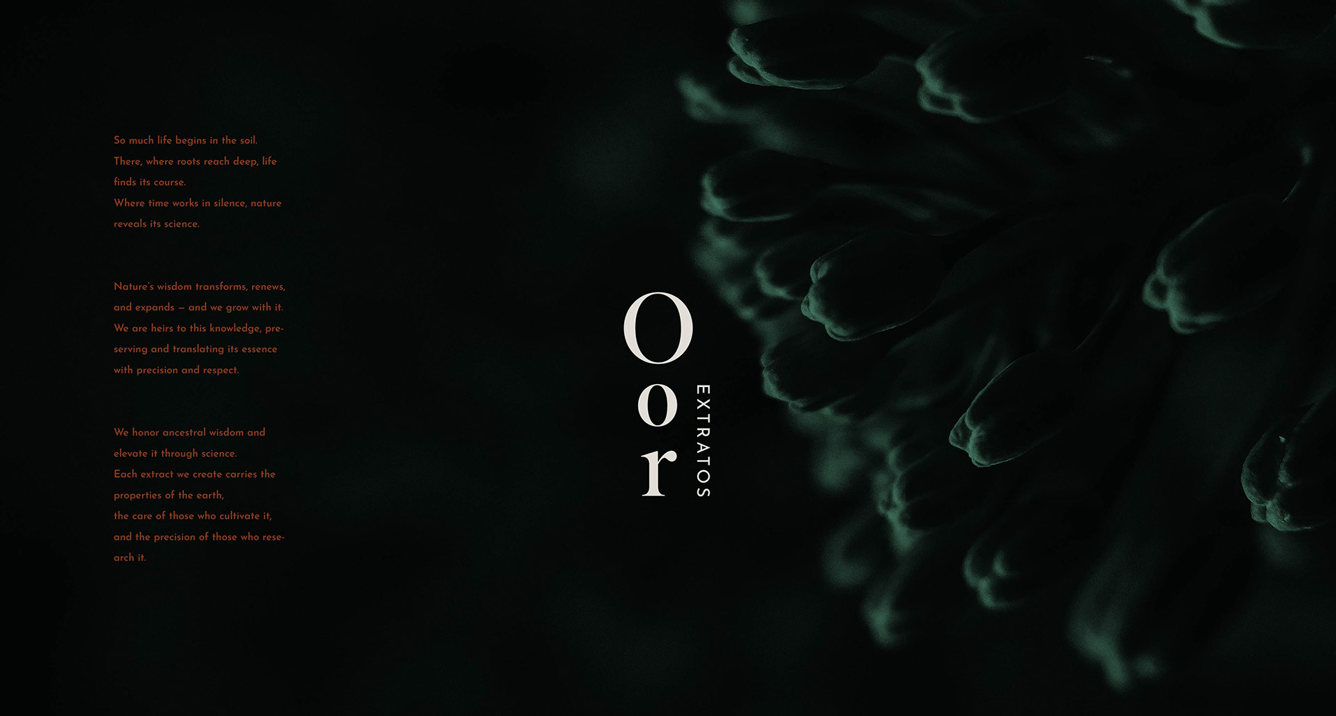
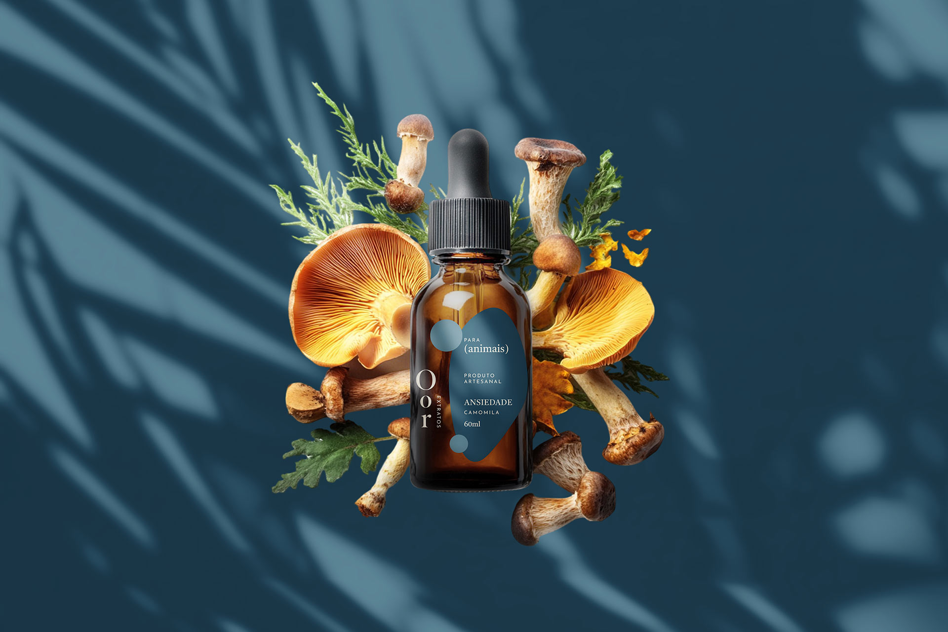
So much life begins in the soil. There, where roots run deep, nature reveals its science. OOR is born at this very junction: the union of scientific rigor and nature’s intelligence to turn ancestral knowledge into precise, trustworthy products.
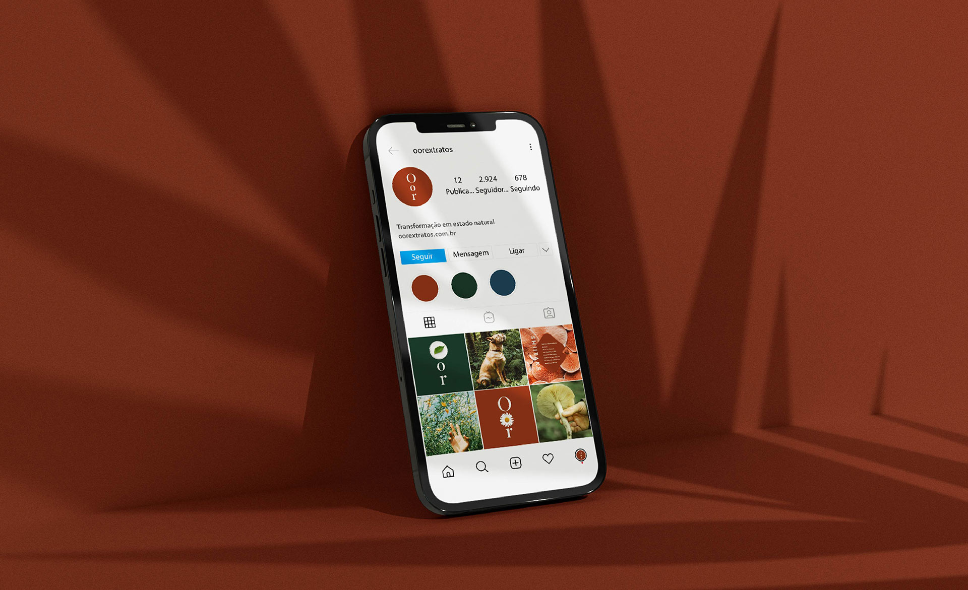
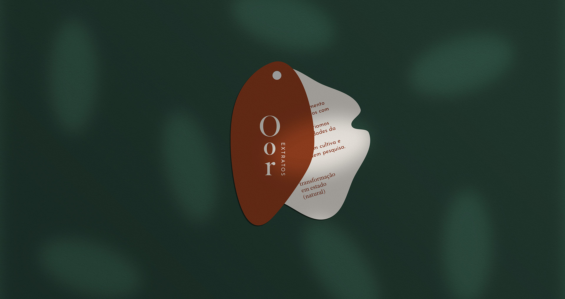
Our brand building began with in-depth research—botanical repertoire, design and language references, and territory/meaning mapping. This process guided every strategic and aesthetic decision, yielding an outcome layered with meaning: functional in use, clear in communication, and rich in symbolism.
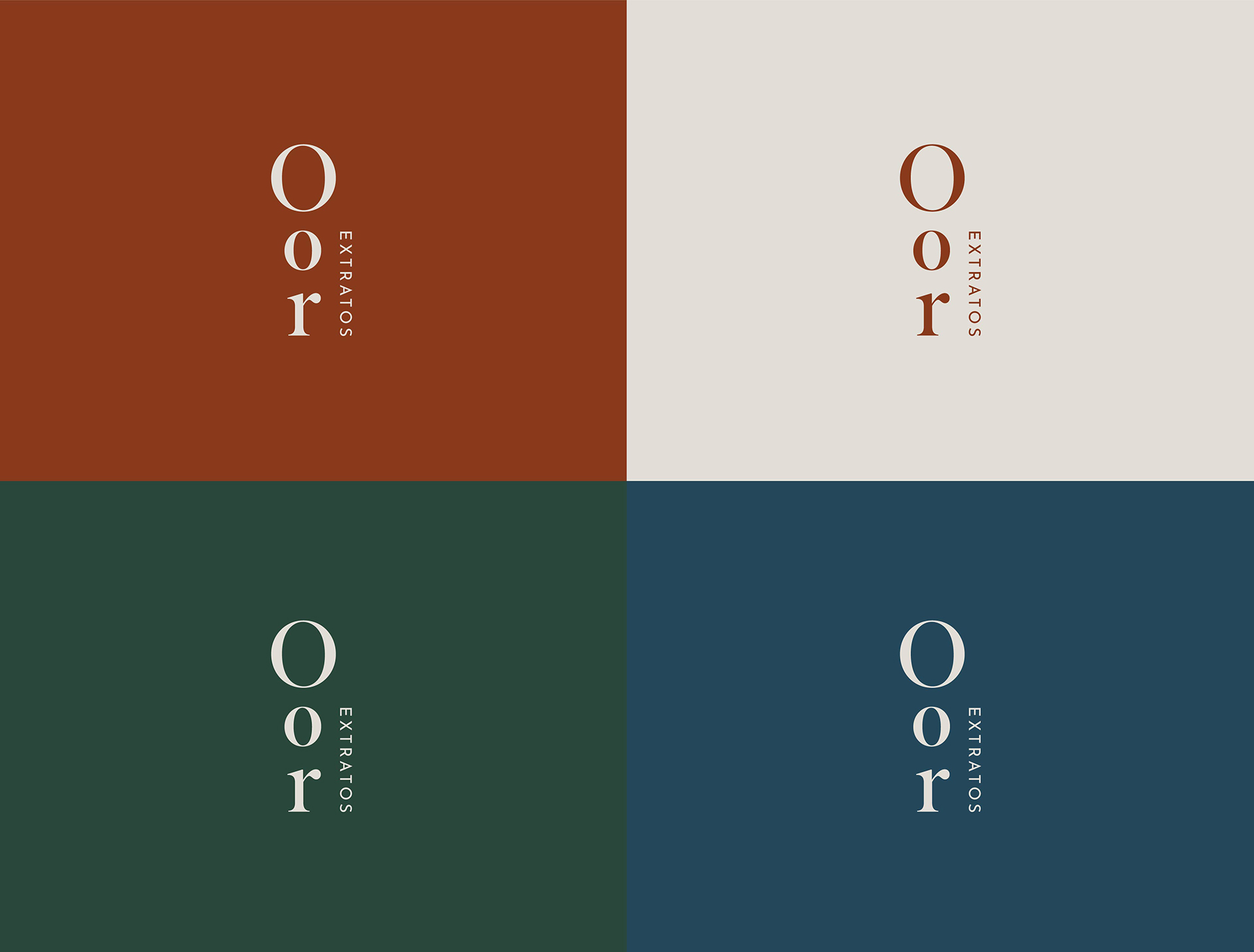
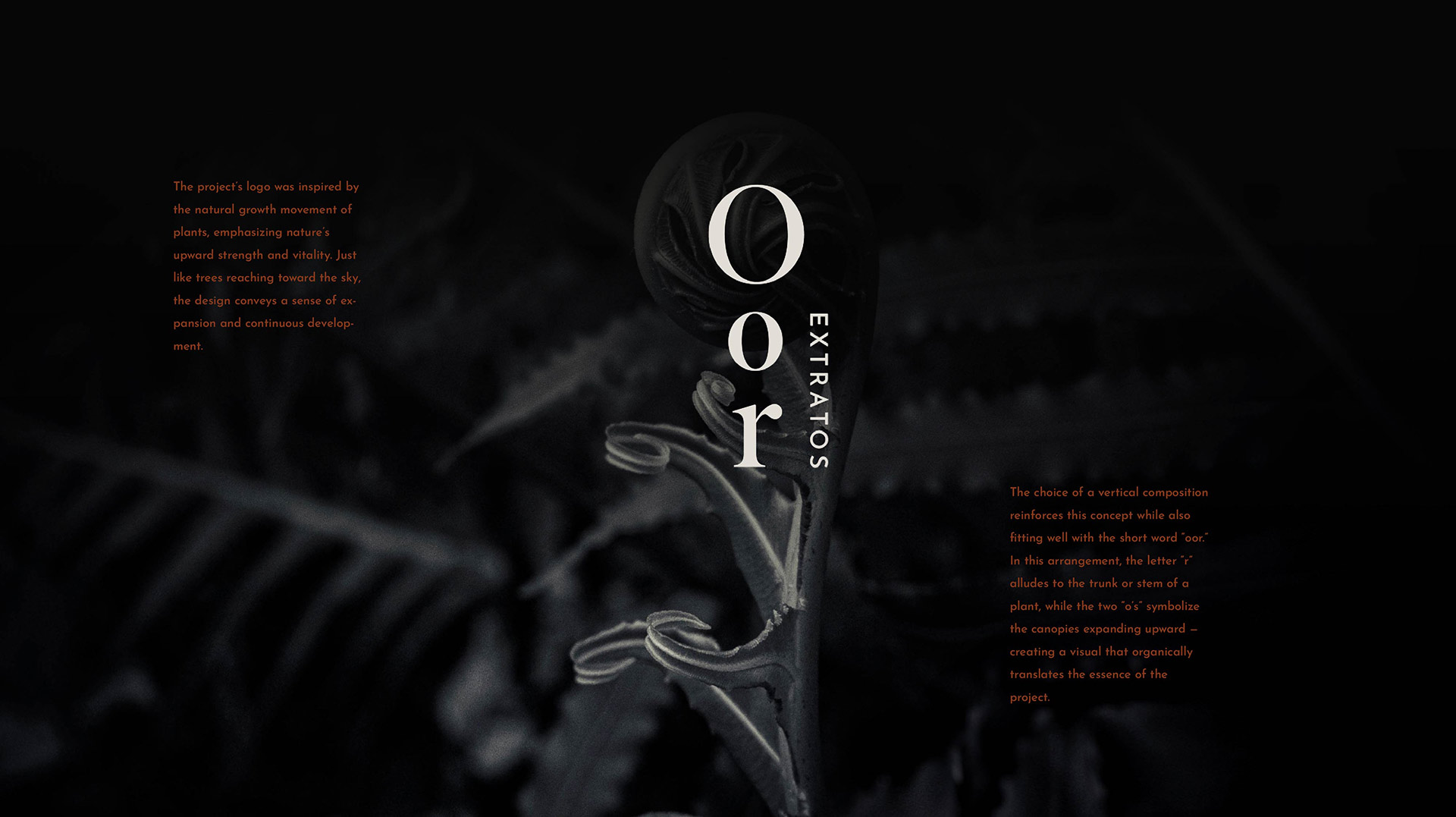
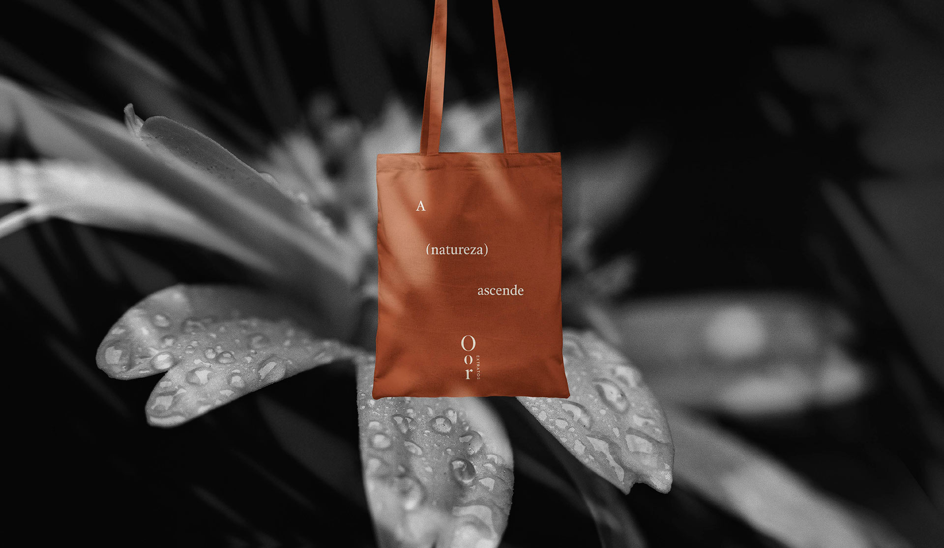
The logo was inspired by the upward movement of plants, expressing strength, vitality, and continuity. Its modulated forms and expanding rhythm echo organic growth—like trees reaching for light—signaling constant evolution and a living system in motion.
The result is a brand that makes visible what nature teaches and science validates: precision with purpose, beauty grounded in evidence, and a narrative that invites a second look.