naming &
branding &
visual identity
Haas Haus — from naming through strategy, an invitation to bring countryside life into the home.
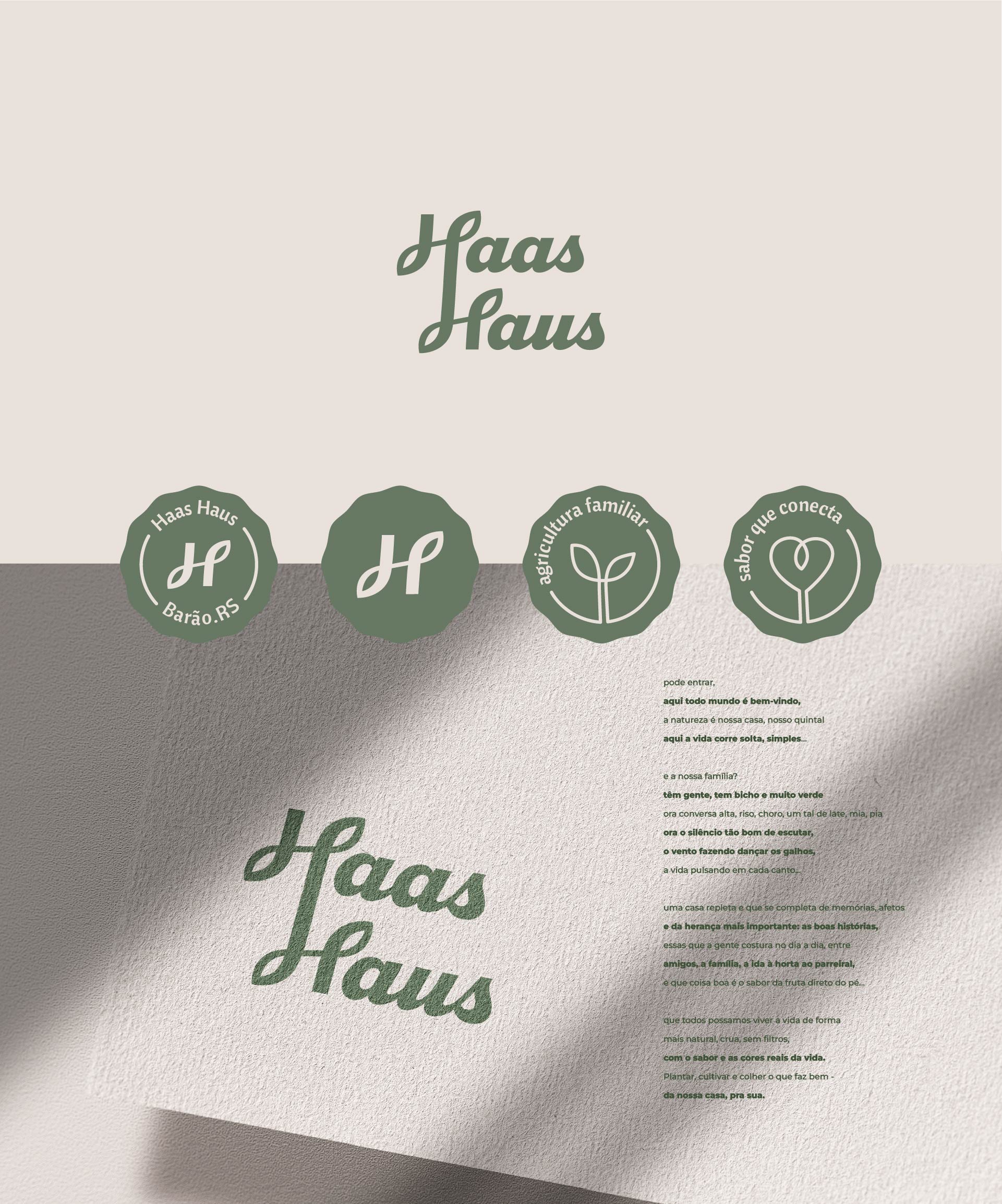
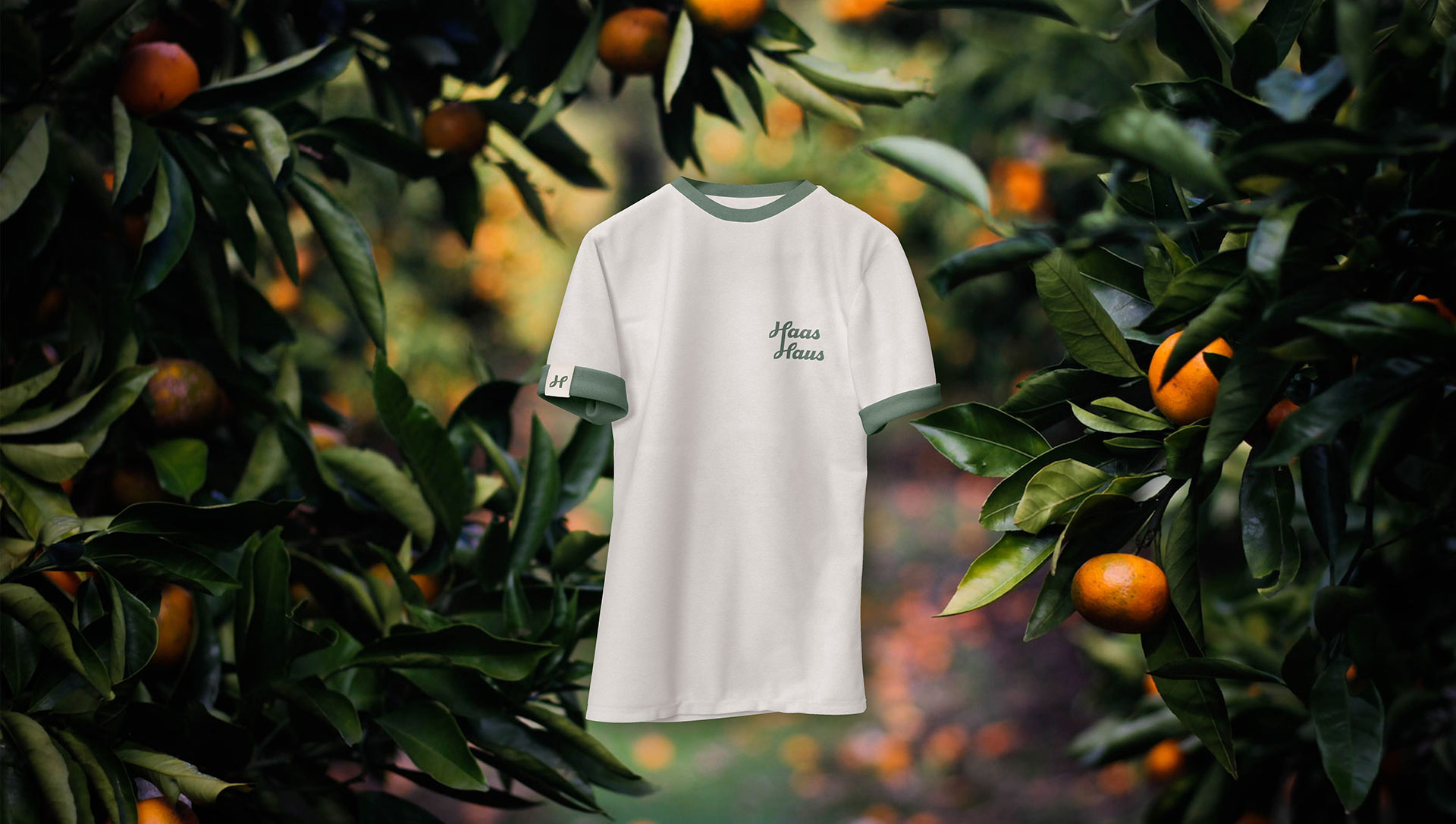
A full-scope project: naming, brand strategy, and visual universe. The brand is led by a young woman continuing her family’s small-scale farming legacy. The name Haas Haus unites a locally recognized surname with the idea of home—proximity, warmth, and continuity.
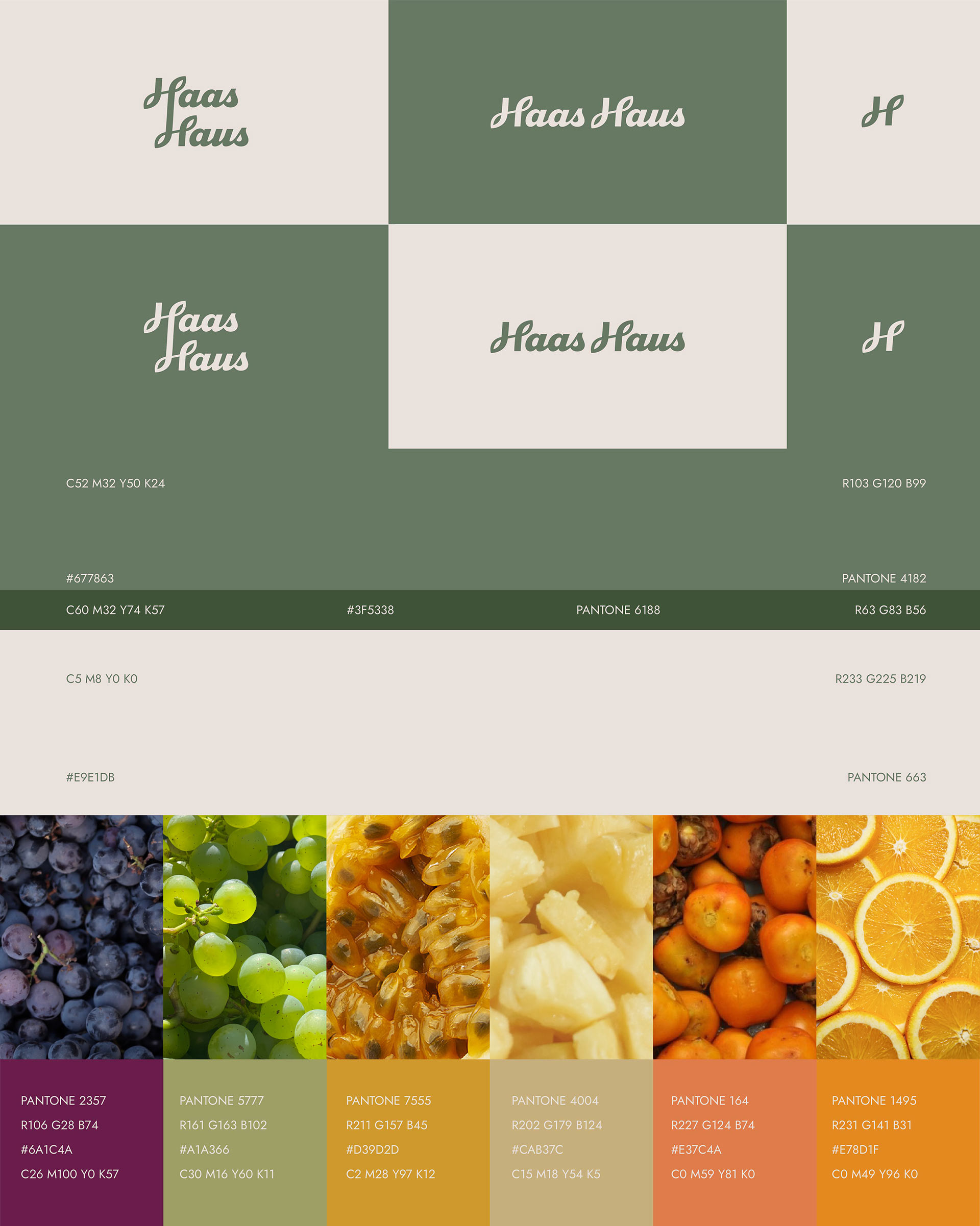
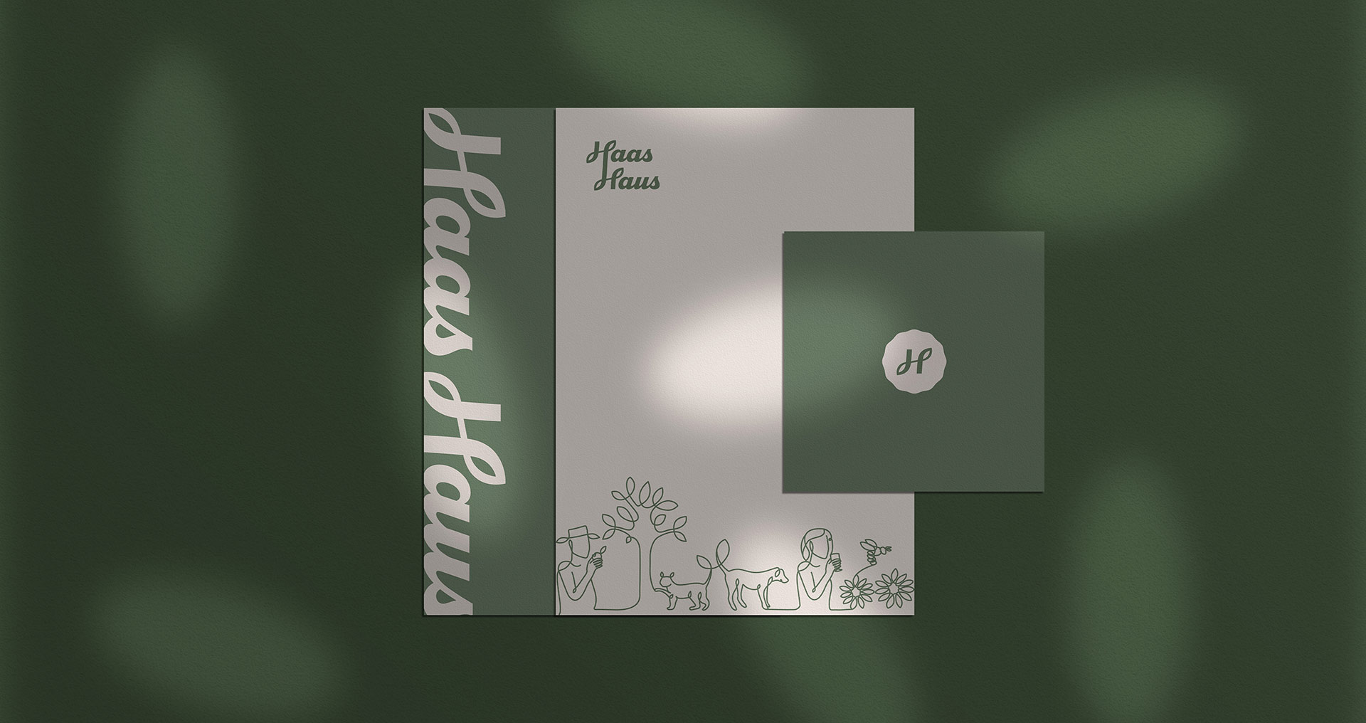
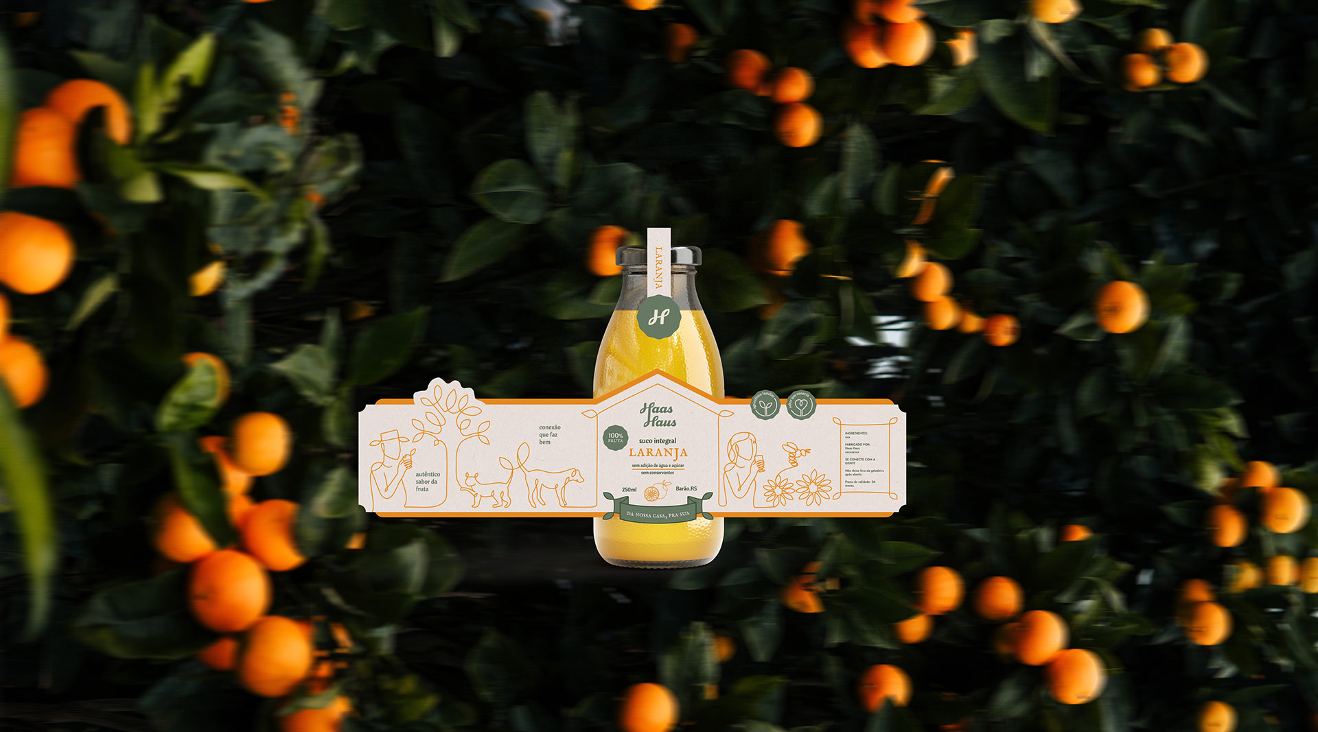
We began with immersion and competitor/territory mapping to define a clear position: make people feel part of this house. Three strategic pillars guided everything: a passion for nature (from the plants that become juices and wines to the animals that accompany daily farm work), artisanal care, and hospitality.
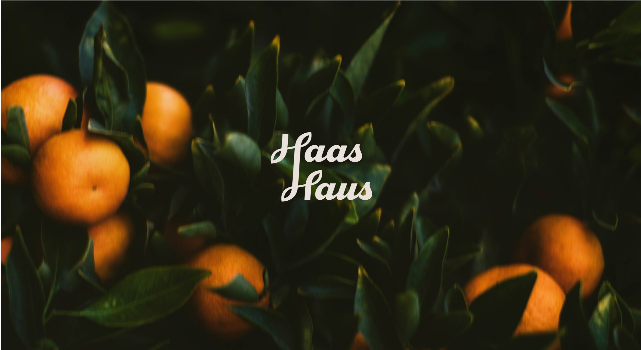
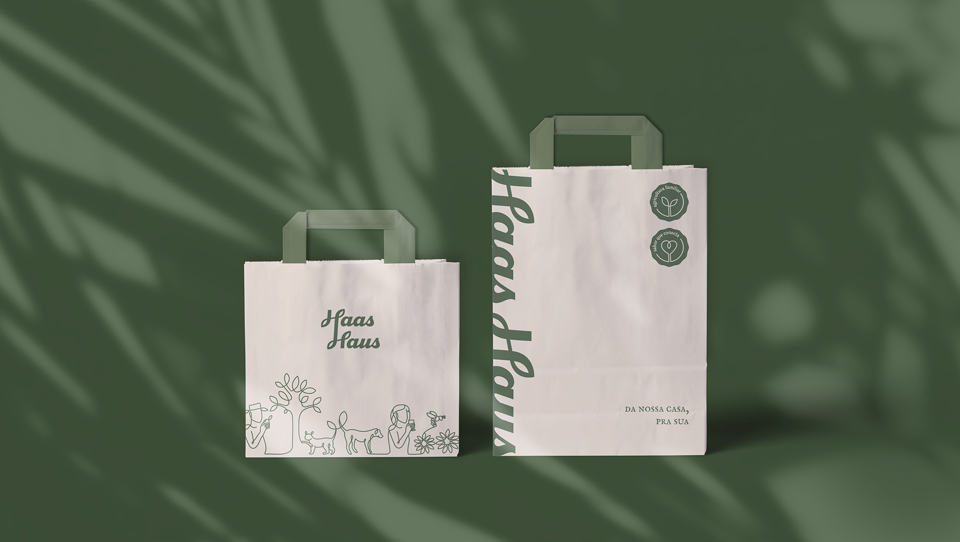
The visual universe translates this essence into a welcoming, modular system: flora-and-fauna iconography, a warm tone of voice, clean composition, and applications that work from labels to point of sale and digital. We delivered tone of voice, identity, packaging/labels, templates, and usage guidelines, plus team training.
Result: a brand that belongs to its territory—and at the same time invites the public in.